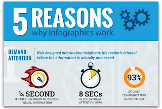
"Infographics are a powerful way of communicating information since they combine data and visual images – left brain and right brain – thereby making it easier to digest, remember and share information."[1]Infographics are widely recognized as an important and powerful educational tool. In fact, online marketing has increasingly become saturated with infographics on a wide array of topics, including public health. Countless books, periodicals and blogs have been dedicated to this subject. According to the Wharton School of Business, infographics are more engaging and convincing because "presenters who used visual language were perceived by audiences as more effective than those not using visuals."[2] Thus, infographics can also serve as powerful HIV advocacy tools.
 |
| Photo Source: missdetails.com |
AIDSinfo has made available an online library for their infographics. They include infographics on treatment options, prevention strategies, and general information about living with HIV.
HIV advocates would be well-served to leverage these infographics (and others) as visual advocacy tools, especially when meeting with policymakers at the federal, state and local levels. Infographics are an excellent way to condense a complex issue into a simple message. The ADAP Advocacy Association, in fact, has published numerous infographics and made them available to stakeholders. In April 2017, an infographic on transgender health was published on Improving Access to Care Among Transgender Men & Women Living with HIV/AIDS under the AIDS Drug Assistance Program.
The Centers for Disease Control & Prevention ("CDC") also offers many HIV-related infographics. CDC infographics and posters include various topics related to HIV including African Americans, Continuum of Care, Gay and Bisexual Men, HIV Testing, Latinos, Pre-Exposure Prophylaxis ("PrEP"), Women, and Youth. The AIDS Education & Training Center Program ("AETCP") has an robust library of these visual presentations on their website.
Last year, two powerful infographics complemented the 2017 National ADAP Monitoring Report when it was released by the National Alliance of State & Territorial AIDS Directors ("NASTAD"). One infographic, Key Characteristics of Ten ADAPs With Highest Rates of Viral Suppression, gives an analysis on ADAPs with the highest rates of viral suppression. The other one, Ryan White Part B and ADAP Partnership to Bolster Health Outcomes, gives an analysis on the Ryan White Part B and ADAP partnership. Anyone who has read NASTAD's annual report know how much data is shared in it, so these infographics provide an amazing snapshot.
Increasingly viral hepatitis is an emerging issue, as more people living with HIV/AIDS are also co-infected with Hepatitis C ("HCV"). The Community Access National Network ("CANN") has used infographics to tackle complex issues surrounding HCV. Among them are their infographics on HCV and Health Law In U.S. Incarceration Settings (2017), and Hepatitis C Therapies Covered by the AIDS Drug Assistance Programs (2015).
Effective grassroots communication and lobbying by HIV advocates can help to influence a position or outcome on a particular issue. Being sensitive to time constraints of policymakers is important, which makes using infographics even more important. The advocates who get the most value from infographics are those that see them as part of a wider strategy to support grassroots efforts at the federal, state, and local levels.
 |
| Photo Source: Ragan.com |
__________
[1] Aleksejeva, Nika (2015, September 6). The Power of Infographics: Why, What and How. Infogram. Retrieved from https://infogram.com/blog/the-power-of-infographics-why-what-and-how/.
[2] Long, Jonathan (2014, September 23). The Power of Visual Content [Infographic]. Market Domination Media®. Retrieved from https://www.marketdominationmedia.com/power-visual-content-infographic/.

No comments:
Post a Comment